Maps and Places; Where have I been?
I did some data analysis on all the info I have gathered over the past 5+ years, and here are my results.
Doing Data analytics on my Data
I created https://find.somethingto.do and https://somethingto.do as a better way for me to interact with all the data that I was already sharing and storing in google maps. Part of the process is to make the data easily accessible and parsable for me. I achieved this by creating JSON files or JavaScript objects that would have all the important information for it to be useful and to function as a quasi-replacement of google maps.
Here is an example object:
   {
      "type": "Feature",
      "properties": {
        "name": "The New York Earth Room",
        "description": "I have been to this room many times and every time I find it amazing that they keep that dirt in it... it is pretty surreal to see because why would you do this? lol",
        "kind": "Gallery",
        "area": "SoHo, Manhattan",
        "last_visit": "July 2025",
        "visits": "3",
        "visited": true
      },
      "geometry": {
        "type": "Point",
        "coordinates": [
          40.7260015,
          -73.9997858
        ]
      }
    }
It has everything that I need for it to be useful to me. Name, Description or Review, Kind of place, Area, How many time I have been there or not, last time I visited this place, Have I visited this place? True or false, and geometric data (Latitude and longitude).
Inspiration
The inspiration to do this analysis is that I have fallen in love with data visualization and from the creation of something to do I have been wanting to create visualizations using D3.js and while have been able to do some of those interactive visualizations using D3, It has been difficult to do some other without running into issues.
The website that inspire me the most were some of the visualizations done by Johnny Harris on his videos, The New York Times (The creator of D3 used to work at the times), and FiveThirtyEight.
Findings
I have been to a lot of places in New York City and it really felt that I have been to way more places than the 755 places I have been too as of July 2025.
I seem to love the neighborhoods south of 14ST, which represents 15% of all places, and that feels kind of true. I used to work in SoHo, and would visit a lot of cafes, restaurants, bars and more places in those neighborhoods.
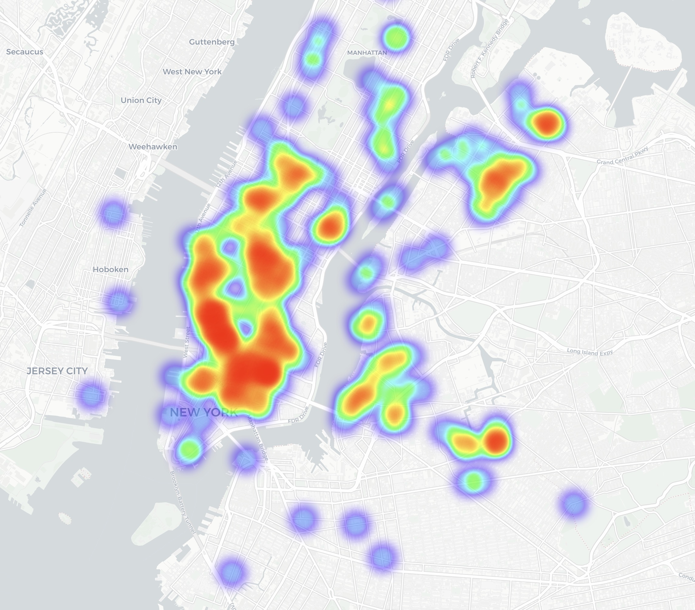 Heatmap showing all the places I have visited.
Heatmap showing all the places I have visited.
This map on the other hand shows were most the places that I want to go to are. I want to travel more, since I get recommendations for places from all over the globe and I wanted to keep them in an somewhat accessible and easily to surface later to me.
The hot-spots are New York City (I live there), France (I have a lot of french friends), Italy (My french friends also love Italy or Sardinia), The Philippines (I have Filipino friends who gave me some reccs), and Spain.
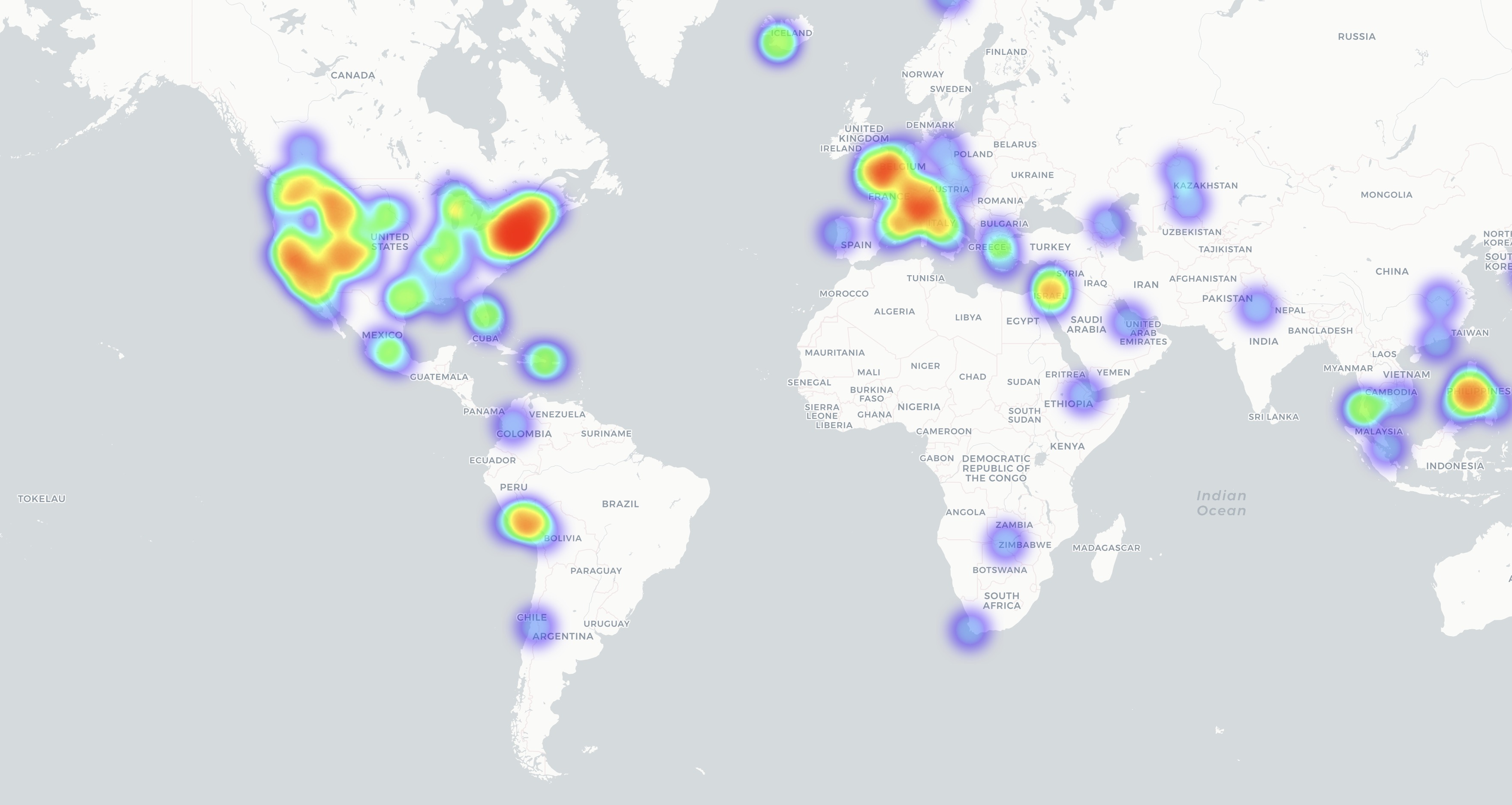 Heatmap showing all the places I want to go to.
Heatmap showing all the places I want to go to.
My first Pie Chart visualization. This visualization shows how many categories and labels I used to have on my objects, this is way more categories and labels than I personally anticipated.
After seeing how huge and redundant it was I simplified it a little bit.
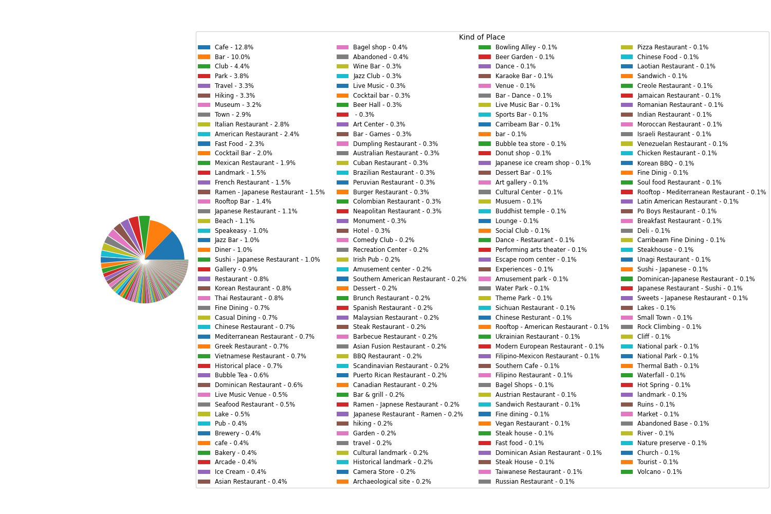 First Iteration of my Pie Chart.
First Iteration of my Pie Chart.
Second Iteration.
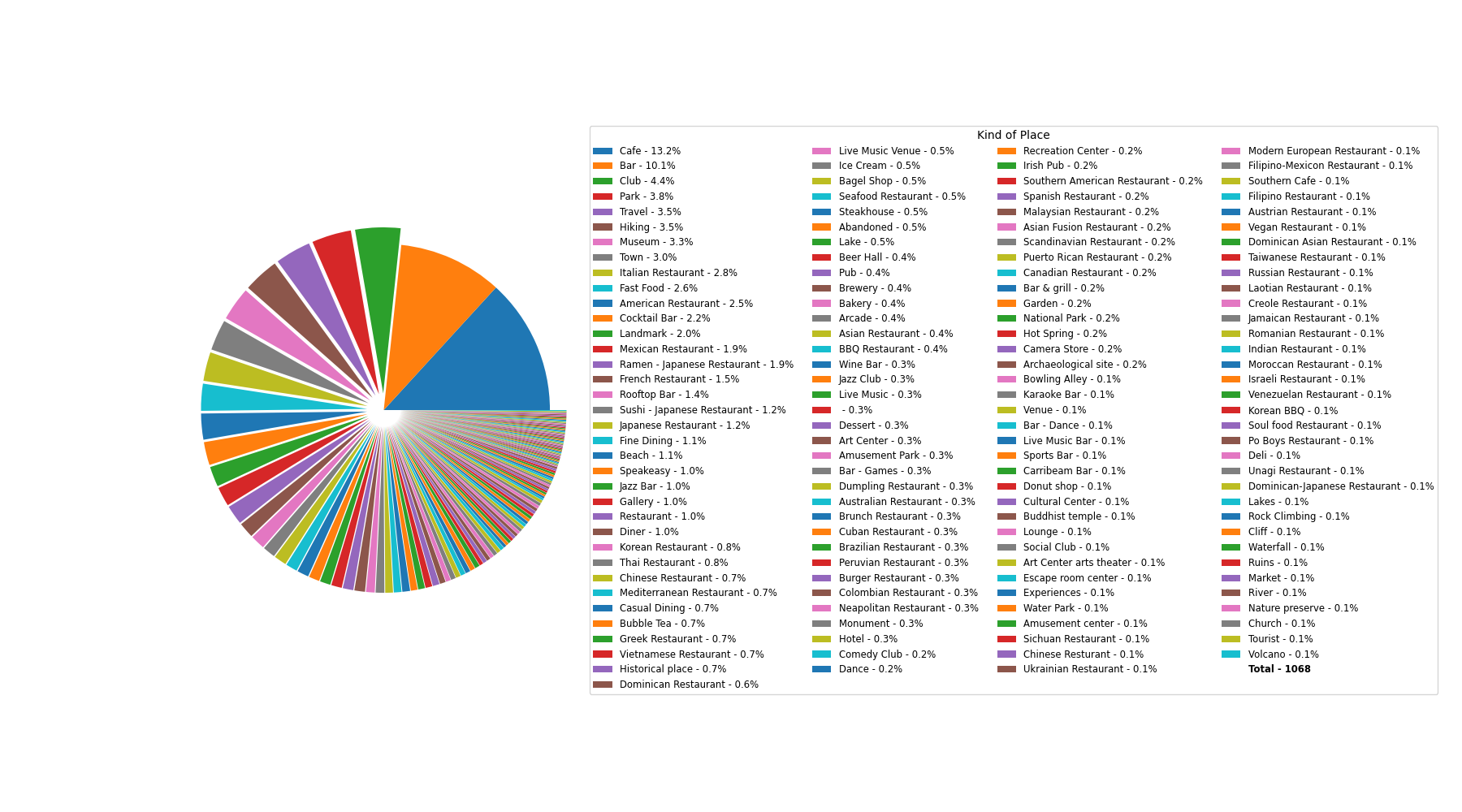 Second Iteration of my Pie Chart.
Second Iteration of my Pie Chart.
Third and last Iteration.
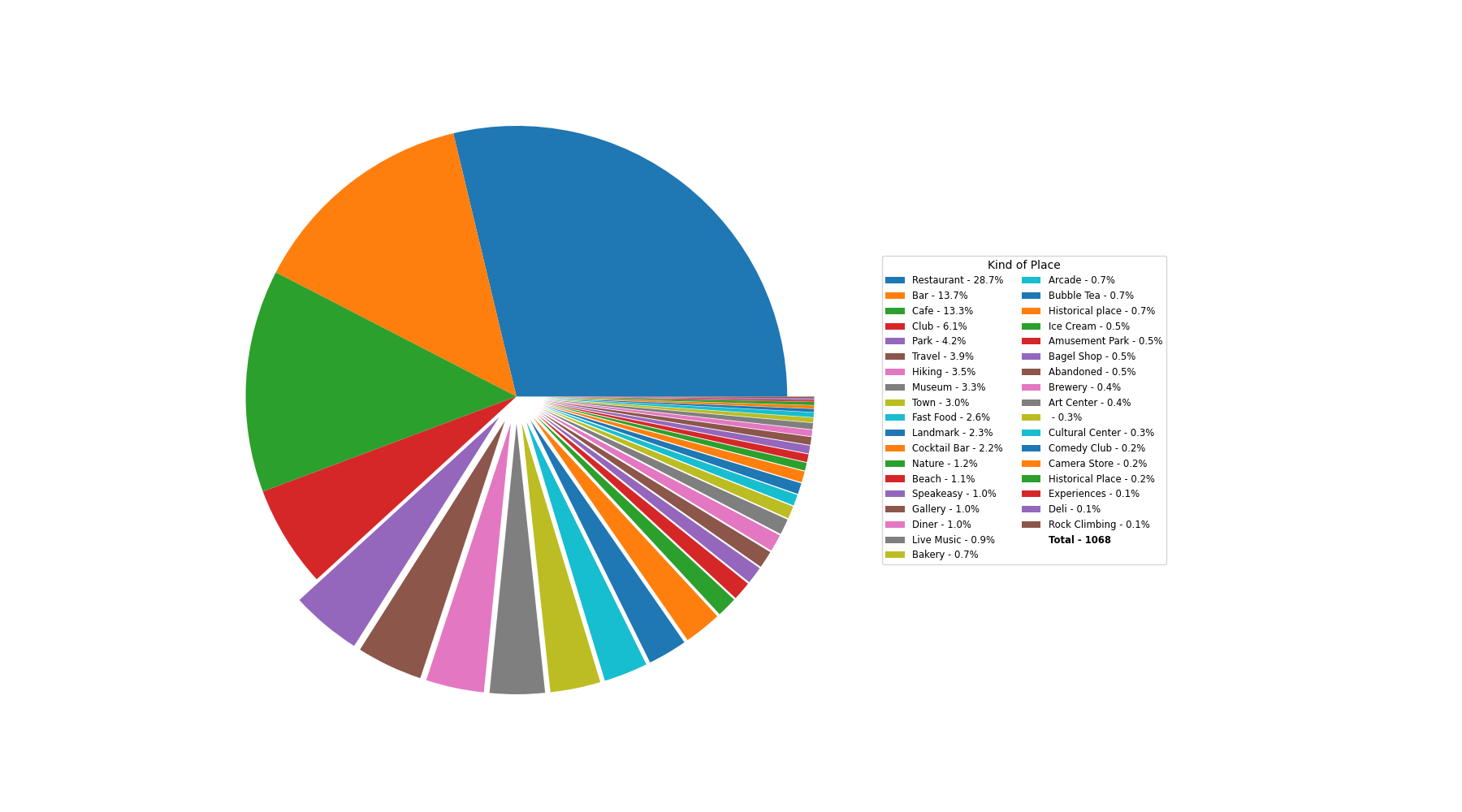 Third Pie Chart. Simplified.
Third Pie Chart. Simplified.
Now you get to interact with the pie chart
The simplified format will only live in this analysis as I actually liked the segmentation of restaurants 🙂 It makes it easier for me to know which kind of restaurant it is, and if I want to have different icons based on the type of restaurant later on it is also easier to implement.
Most Visited Area
If we combine all the south of 14st neighborhoods the order would be as follows: 1. SoHo / East Village / LES / Greenwich 2. Midtown 3. Astoria. If not... See below
Now this divition makes sense Which makes sense I used to work in that area for couple of years, and spend a lot of time in that area.
Heatmap showing all the places.
Heatmap showing all the places.
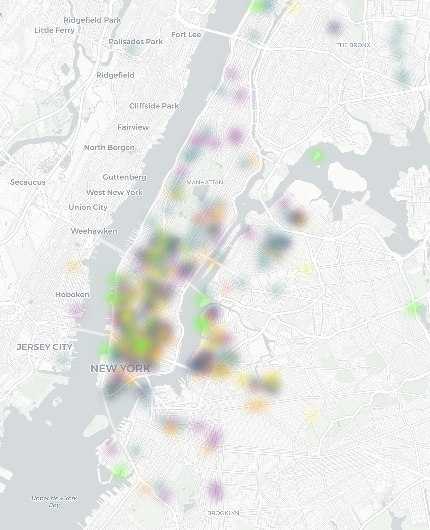 color coded heatmap showing all the places categorize by color.
color coded heatmap showing all the places categorize by color.
Where have I been?
Look and you shall see!
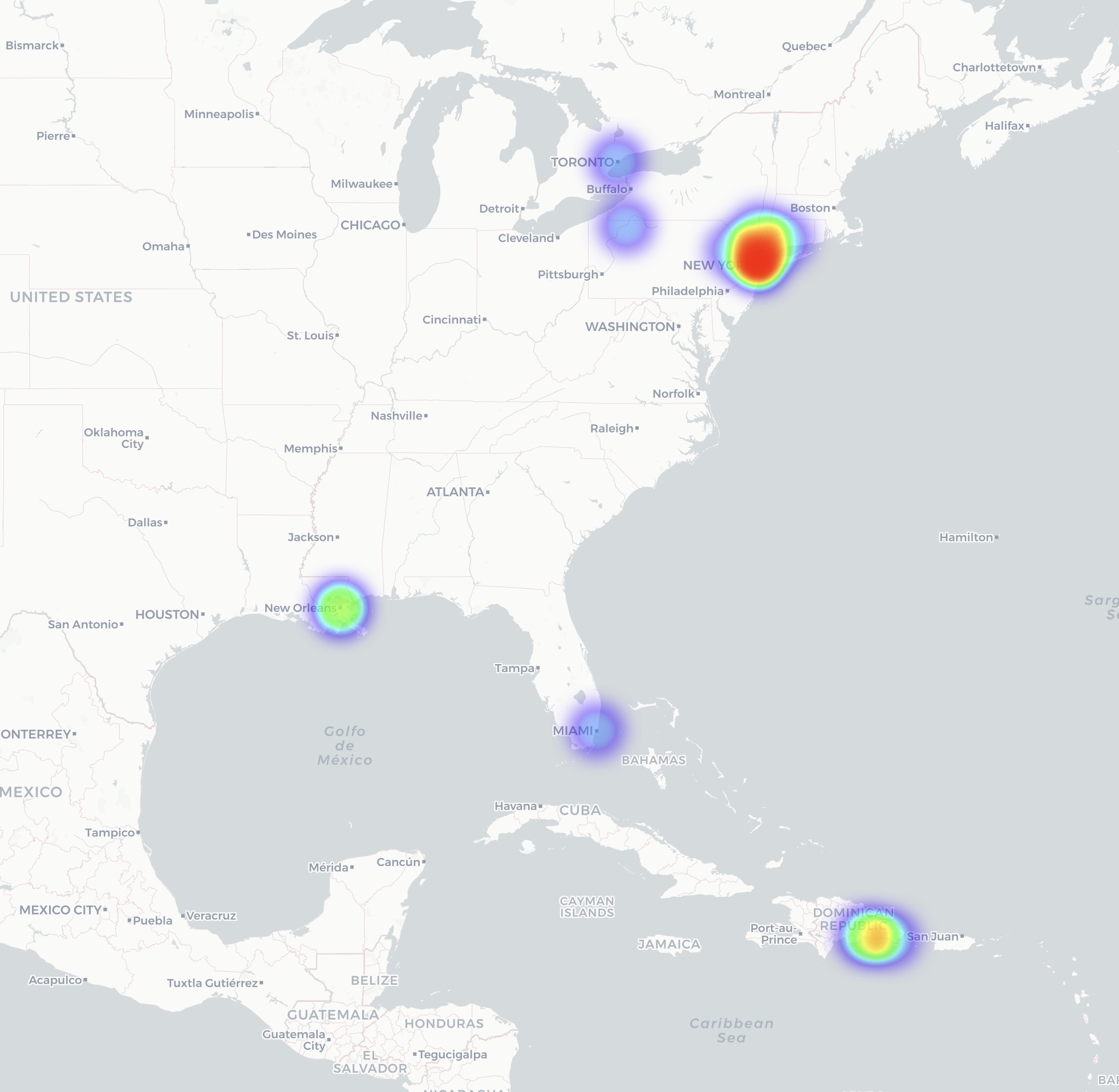 Heatmap showing the areas that I have been to. Miami, New Orleans, Dominican Republic, New York City Metro, Buffalo, Toronto.
Heatmap showing the areas that I have been to. Miami, New Orleans, Dominican Republic, New York City Metro, Buffalo, Toronto.
Yes I have not traveled intensively yet
These are some of the areas that I would love to go too. There are a lot of parks and monuments represented on the map below, I enjoy history and nature what can say.
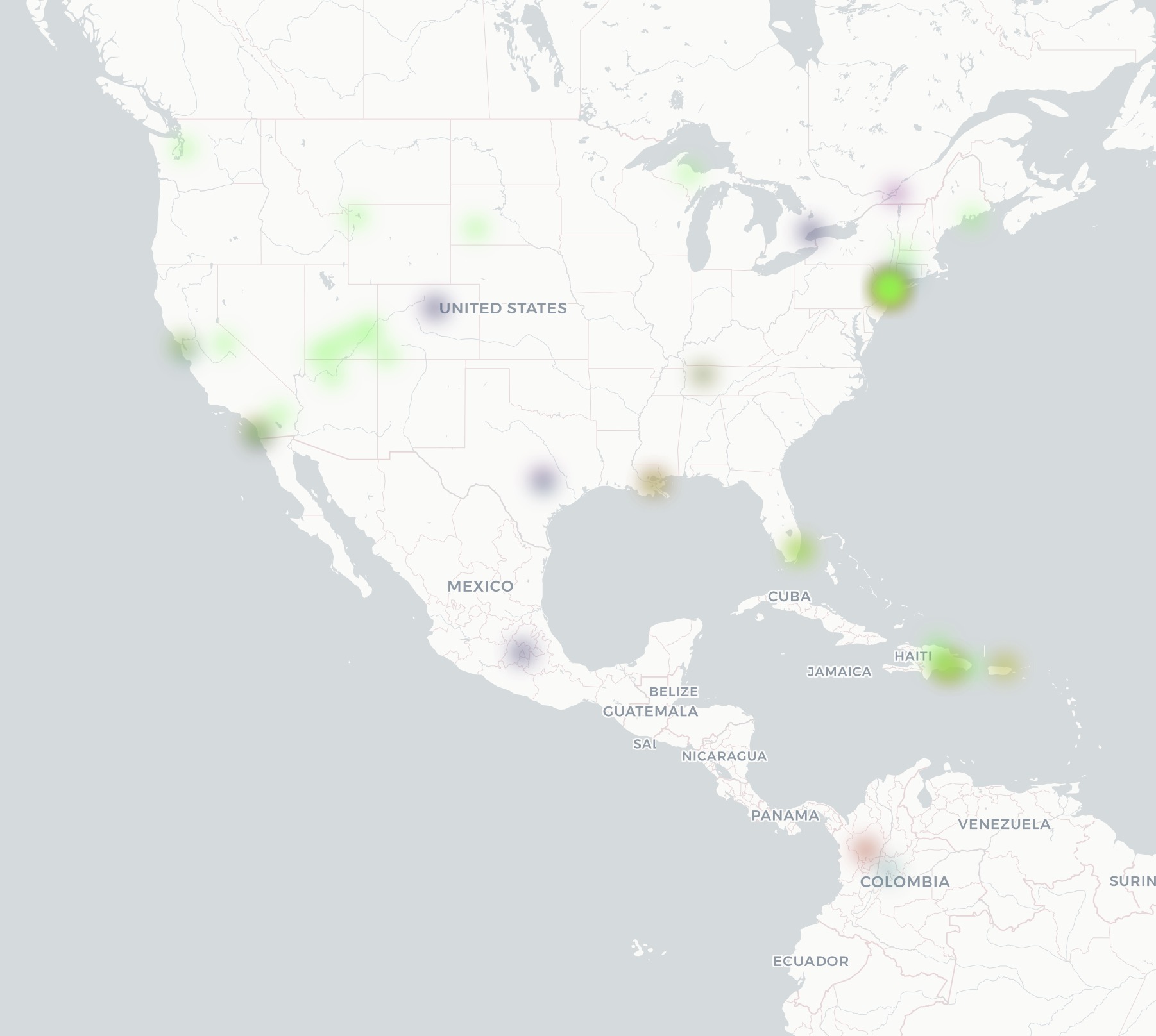 Color coded heatmap showing North America, part of South America, and the Caribbean.
Color coded heatmap showing North America, part of South America, and the Caribbean.
Favorite Kind of place
Restaurants. It make sense I eat everyday and a lot of the time I try to go to a restaurant to try something new.
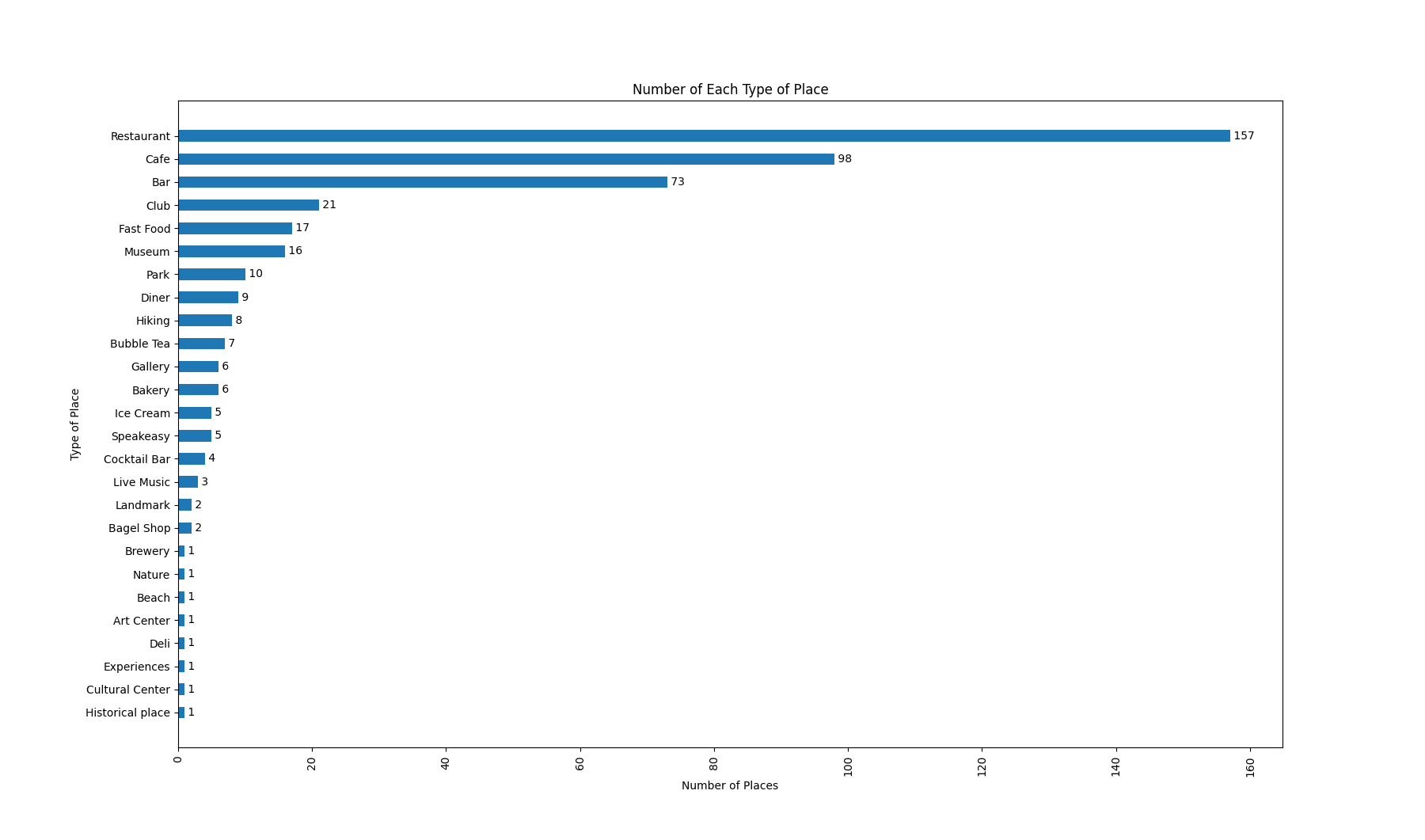 Bar Chart. Showing how many places I have gone to in each category.
Bar Chart. Showing how many places I have gone to in each category.
Favorite kind of restaurant
I love Japanese food and that shows here. I usually separate Sushi, Ramen, and general Japanese restaurants but here I had then together to make easier to read. Also in the graph above you can see that I have visited almost all the Japanese Restaurants I have save and/or heard, exceptions are the ones abroad, which makes sense.
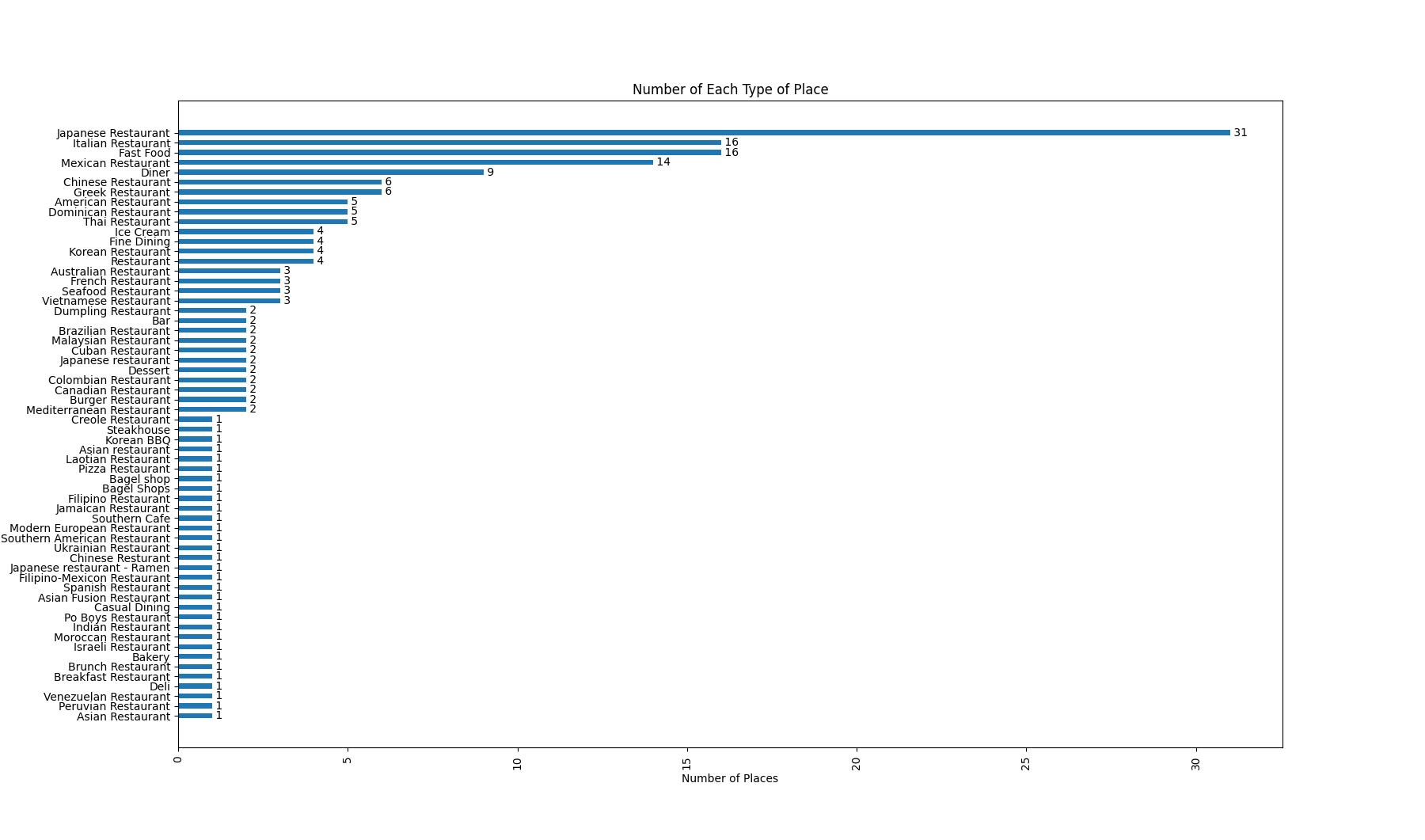 Bar Chart showing which kind of restaurant I have gone the most.
Bar Chart showing which kind of restaurant I have gone the most.
How many places are there?
My list have 1504 places in total. That means places that I have been and I want to go.
See the distribution below
Total number of places by Category
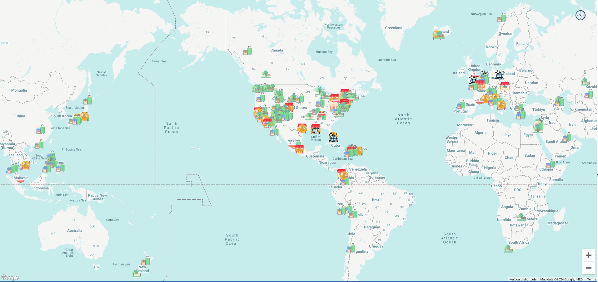 Screenshot of somethingto.do where I keep all this info.
Screenshot of somethingto.do where I keep all this info.
Before you go here are some interesting graphs of where I spend a lot of my time haha
Code
Bar Charts
import matplotlib.pyplot as plt
import pandas as pd
import json

# Load the data
with open('food.json') as f:
    data = json.load(f)

# Convert the data to a DataFrame
df = pd.json_normalize(data['features'])

# Filter the DataFrame based on the 'visited' property
df_visited = df[df['properties.visited'] == True]

# Count the number of each type of place
counts = df_visited['properties.kind'].value_counts()

# Count the number of each type of place
counts = counts.sort_values()

# Create a bar chart
plt.figure(figsize=(12, 16))
bars = plt.barh(counts.index, counts.values, height=0.5)

# Add the total amount of places next to each bar
for bar in bars:
    width = bar.get_width()
    plt.text(width, bar.get_y() + bar.get_height()/2, f' {width}', va='center')

plt.ylabel('Type of Place')
plt.xlabel('Number of Places')
plt.title('Number of Each Type of Place')
plt.xticks(rotation=90)
plt.show()
Heat-maps of visited and not visited places
import matplotlib.pyplot as plt
import folium
import json
from folium.plugins import HeatMap
import pandas as pd

with open('everything.json') as f:
    data = json.load(f)

# Convert the list of dictionaries into a DataFrame
df = pd.json_normalize(data['features'])

df['latitude'] = df['geometry.coordinates'].apply(lambda x: x[0] if len(x) > 1 else None)
df['longitude'] = df['geometry.coordinates'].apply(lambda x: x[1]if len(x) > 1 else None)

# Filter the DataFrame based on the 'visited' attribute
df_visited = df[df['properties.visited'] == True]
df_not_visited = df[df['properties.visited'] == False]

# Create a base map
m = folium.Map([40.7128, -74.0060], zoom_start=11, tiles='CartoDB Positron')

# Create a list of [latitude, longitude] pairs for visited and not visited places
locations_visited = df_visited[['latitude', 'longitude']].values.tolist()
locations_not_visited = df_not_visited[['latitude', 'longitude']].values.tolist()

# Add a heatmap for visited places
HeatMap(locations_visited).add_to(m)

# Create a new map for not visited places
m_not_visited = folium.Map([40.7128, -74.0060], zoom_start=11, tiles='CartoDB Positron')

# Add a heatmap for not visited places
HeatMap(locations_not_visited).add_to(m_not_visited)

# Display the maps
m.save('heatmap_visited.html')
m_not_visited.save('heatmap_not_visited.html')
Pie chart
import json
import matplotlib.pyplot as plt
from matplotlib.patches import Patch

# Load the data
with open('everything.json') as f:
    data = json.load(f)

# Extract the kinds of places and their counts
kinds = {}
for feature in data["features"]:
    kind = feature["properties"].get("kind", None)
    if kind is not None:
        if kind in kinds:
         kinds[kind] += 1
        else:
            kinds[kind] = 1

# Calculate the total count
total = sum(kinds.values())

# Sort the kinds by count in descending order
kinds = dict(sorted(kinds.items(), key=lambda item: item[1], reverse=True))

# Create the pie chart
plt.figure(figsize=(20, 10))  # Adjust the size as needed
explode = [0.1 if v < sum(kinds.values()) * 0.05 else 0 for v in kinds.values()]
wedges, _ = plt.pie(kinds.values(), labels=None, explode=explode)

# Create the legend labels with percentages
labels = [f'{k} - {v / total * 100:.1f}%' for k, v in kinds.items()]
# Add the total count to the legend
labels.append(f'Total - {total}')

# Create legend handles
handles = wedges + [Patch(facecolor='none')]

legend = plt.legend(handles, labels, title="Kind of Place", bbox_to_anchor=(1, 0, 0, 1), loc="center left", ncol=2, fontsize='small')

# Make the total count bold
legendHandles = legend.legendHandles
legendHandles[-1].set_visible(False)
legend.texts[-1].set_weight('bold')

plt.axis('equal')  # Equal aspect ratio ensures that pie is drawn as a circle.
# plt.tight_layout()
# Manually adjust the subplot parameters
plt.subplots_adjust(right=0.60)  # Adjust this value as needed to make room for the legend
plt.show()
Colored Heat-map
import json
import pandas as pd
import folium
from folium.plugins import HeatMap
from branca.element import Template, MacroElement
# Load your GeoJSON data
with open('everything.json', 'r') as f:
geojson_data = json.load(f)
# Convert the GeoJSON data to a DataFrame
df = pd.json_normalize(geojson_data['features'])
# Extract latitude and longitude from the 'geometry.coordinates' column
df['latitude'] = df['geometry.coordinates'].apply(lambda x: x[0] if len(x) > 1 else None)
df['longitude'] = df['geometry.coordinates'].apply(lambda x: x[1]if len(x) > 1 else None)
# Define a color gradient for each type of place
colors = {
'Cafe': {0.2: 'purple', 0.4: 'purple', 0.6: 'purple', 0.8: 'purple', 1: 'purple'},
'Bar': {0.2: 'orange', 0.4: 'orange', 0.6: 'orange', 0.8: 'orange', 1: 'orange'},
'Restaurant': {0.2: 'teal', 0.4: 'teal', 0.6: 'teal', 0.8: 'teal', 1: 'teal'},
'Speakeasy': {0.2: 'salmon', 0.4: 'salmon', 0.6: 'salmon', 0.8: 'salmon', 1: 'salmon'},
'Club': {0.2: 'yellow', 0.4: 'yellow', 0.6: 'yellow', 0.8: 'yellow', 1: 'yellow'},
'Park': {0.2: 'lime', 0.4: 'lime', 0.6: 'lime', 0.8: 'lime', 1: 'lime'},
# I found that using the same color gives a more pleasent feeling and cohesiveness
# to the heatmap
# 'Cafe': {0.2: 'blue', 0.4: 'purple', 0.6: 'pink', 0.8: 'orange', 1: 'red'},
# 'Bar': {0.2: 'green', 0.4: 'yellow', 0.6: 'orange', 0.8: 'red', 1: 'maroon'},
# 'Restaurant': {0.2: 'navy', 0.4: 'blue', 0.6: 'aqua', 0.8: 'teal', 1: 'green'},
# 'Speakeasy': {0.2: 'maroon', 0.4: 'red', 0.6: 'salmon', 0.8: 'pink', 1: 'white'},
# 'Club': {0.2: 'black', 0.4: 'brown', 0.6: 'orange', 0.8: 'yellow', 1: 'white'},
# 'Park': {0.2: 'darkgreen', 0.4: 'green', 0.6: 'lime', 0.8: 'yellow', 1: 'white'},
# Add more types of places and colors as needed
}
# Create a base map
m = folium.Map([40.7128, -74.0060], zoom_start=11, tiles='CartoDB Positron')
# Create a separate heatmap for each type of place
for place_kind, color in colors.items():
# Filter the DataFrame based on the type of place
df_filtered = df[df['properties.kind'] == place_kind]
# Add a heatmap to the base map
HeatMap(data=df_filtered[['latitude', 'longitude']].dropna().groupby(['latitude', 'longitude']).sum().reset_index().values.tolist(), gradient=color, radius=8, max_zoom=13).add_to(m)
# Create a legend and added to the HTML
template = """
{% macro html(this, kwargs) %}
<div style="
position: fixed;
bottom: 100px;
left: 50px;
width: 200px;
height: 110px;
z-index:9999;
font-size:14px;
">
<p><a style="color:#A020F0;">█</a> Cafe</p>
<p><a style="color:#FF7F00;">█</a> Bar</p>
<p><a style="color:#008080;">█</a> Restaurant</p>
<p><a style="color:#FA8072;">█</a> Speakeasy</p>
<p><a style="color:#FFFF00;">█</a> Club</p>
<p><a style="color:#00FF00;">█</a> Park</p>
</div>
{% endmacro %}
"""
macro = MacroElement()
macro._template = Template(template)
m.get_root().add_child(macro)
m.save('heatmap.html')
If you would like craft your own journey, here is the app link: